The first part of this series described approaches for using social graphs to illustrate the way members of enterprise social networks comment on each others’ content. All the examples in part 1 used very small networks to describe these concepts. Let us now apply these to larger networks, and see how different graph layouts can highlight different aspects of the network.
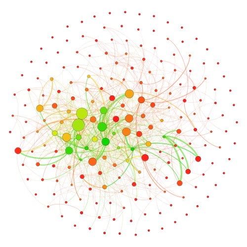
The graph below shows comments between members of a 200-user network during one month. The graph layout is determined by the Fruchterman-Reingold algorithm, a force-directed algorithm which encourages closely related nodes to be plotted near each other. The effect of this is that the best-connected members of the network gravitate to the centre of the graph, and the least-connected to the edges.
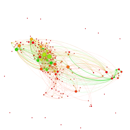
This immediately highlights which members are engaging well, and which are completely disconnected from other members. However, as the network grows, this layout becomes increasingly poor at identifying clusters in the network which represent groups of members who are working closely together. The graph below shows exactly the same data, with a different layout algorithm which aims to identify these clusters.
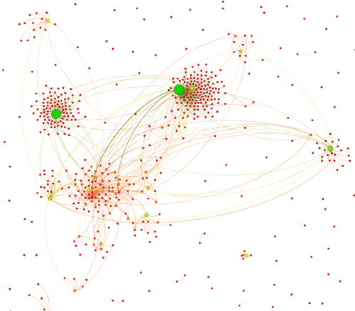
Here we see one central cluster of usage, with several smaller clusters. However, the clusters remain fairly closely connected to each other, as one might expect in a small company. In larger companies, the clusters are typically more distinctly separated, as shown in the graph below.
It also becomes very obvious from a layout like this how some clusters are too heavily dependent on single members to hold them together.
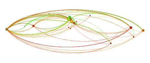
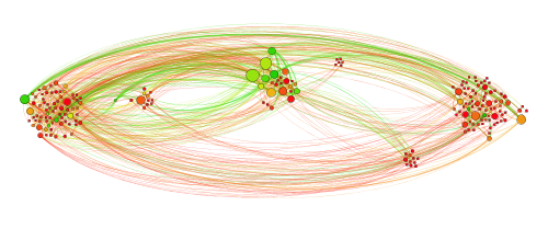
Another interesting way to lay out the graph is based on geographical location. This highlights the communication across regions in a globally-distributed organization. The graph below plots all the members of the network from the first example based on their primary office location (centred on zero line of longitude).
Of course, the problem with such a layout is that it plots members at the same location on top of each other. This is a useful reminder that the most scientifically-correct graph is not necessarily the most useful. If we force members at the same location slightly apart from each other, we get a much clearer picture of inter-region communication.
What we lose in geographical accuracy, we gain in insight into network behaviour. Here we can quickly see three major centres of activity and three smaller, less active locations. We also see very strong cross-region links, suggesting the network has been successful in connecting a geographically-distributed workforce.
I am often asked which layout is best. The answer, of course, is that it depends on what you want to know. Social graphs can show a wide variety of different relationships – all of the examples covered here and in part 1 have focused on comments between members but it is also useful to visualize relationships such as members viewing other members’ content and members assigning tasks to other members. Members can also be grouped together into departments to see the connectivity between departments within an organisation.

