One of the best ways of understanding precisely how your enterprise social network is being used is to visualize the activity using a social graph. This two part series will look at ways presenting the activity and connections in your social network to illustrate where it is working well, and where further work is required.
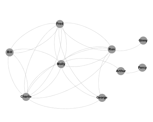
The term social graph was popularized by Facebook’s use of it in 2007, but the principles of illustrating networks in this way is nothing new. The basic principle is that members of the network are represented by a nodes or vertices, and the connections between members are represented by edges. So the connections between 9 members of a network may look something like this:
This is useful, because it shows who is well connected (Molly) and who is less so (Ginny and Percy). But it doesn’t tell us much more than that, because it doesn’t describe the nature of the relationships between each member. Indeed, this is the major failing of LinkedIn’s InMaps, which although beautiful, are of relatively little use because my connection with someone I have worked with for 10 years is represented in exactly the same way as someone I met once. An enterprise social network has much richer information about the relationships between members, so let us consider how best to illustrate this.
Firstly, we need to decide the type of relationship we want to represent. Most people initially think of showing who follows who, but I find that this is little more useful than InMaps; following relationships often bear very little relation to how people actually communicate. I find that a far more meaningful relationship to show is the number of comments exchanged between members, as this more accurately represents the extent to which members are collaborating.
It is easy to extract this comment activity from a Clearvale network using the API. These can then be analysed in a variety of different tools – in the examples here, I am using Gephi. Detailed analysis of the data is something our consulting team helps customers with through our Social Engagement Analysis Service.
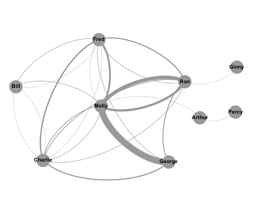
In the graph below, the weight of the lines between members indicate the number of comments they have given to and received from other members.
We immediately see the most active relationships in the network (Molly/George, Molly/Ron). We also see that some seemingly well-connected members (Bill) are actually weakly connected with several members, but not strongly connected with any.
Of course, not all relationships are equal, so it is valuable to distinguish between comments created and comments received. You may notice that in the previous graphs there are two lines between some nodes. This is because it is a directed graph, with incoming and outgoing indicated separately.
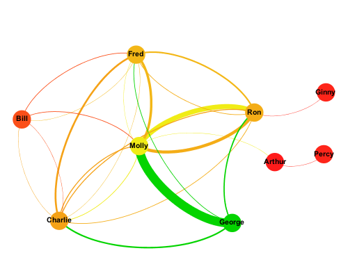
In the next graph, each node is coloured based on the number of comments created – green represents many comments, red represents few, yellow and orange somewhere in between. The edges are coloured to match the source node, making it easier to see the direction of the comments.
Here we see that although Molly is the centre of the network, the vast majority of her comments are directed towards Ron. We also see that it is George who is the most activer commenter, and Bill’s weak connection with the rest of the network becomes more apparent.
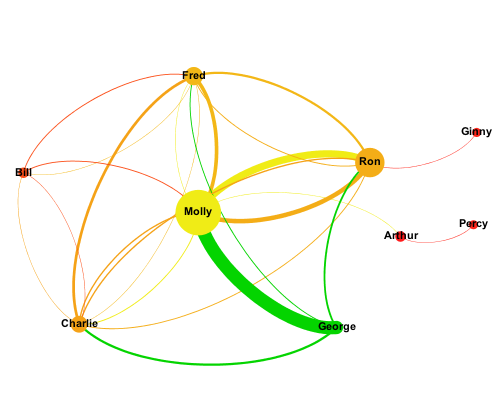
Finally, we can change the size of the nodes to represent the number of comments received.
Now, at a glance, we can see the rather more complex nature of relationships between network members. George creates a lot of comments but receives no more than Ginny or Percy. Molly receives a lot of comments, but creates few except on Ron’s content. We can use this deeper understanding of network member behaviour to help formulate our network adoption strategy.
In part two of this series, we will look at how these principles can be applied to much larger networks, and how different layout techniques can be used to highlight communication between departments and regions within an organisation.
